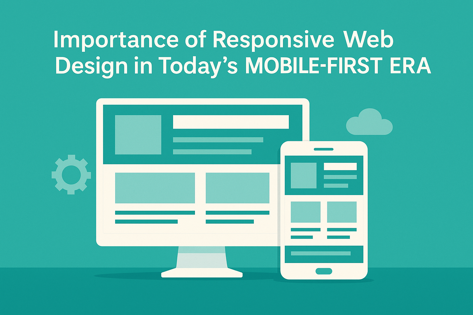
In today’s digital landscape, the proliferation of mobile devices has transformed the way people access and interact with the internet. With smartphones and tablets becoming the primary means of online engagement for a large portion of the global population, the importance of responsive web design has never been greater. Responsive web design ensures that websites adapt seamlessly to various screen sizes and devices, providing users with an optimal viewing and browsing experience. This comprehensive guide explores the significance of responsive web design in the mobile-first era and its impact on user engagement, SEO, and business success.
Evolving User Behavior
Mobile Device Usage
The widespread adoption of mobile devices has fundamentally changed user behavior. People now expect instant access to information, products, and services from their smartphones and tablets, whether they’re at home, on the go, or in the office. In fact, mobile devices account for a significant portion of internet traffic globally, surpassing desktop usage in many regions.
Multi-Device Usage
Users frequently switch between devices throughout the day, transitioning from smartphones to tablets to desktop computers based on their preferences and context. This multi-device usage underscores the importance of providing a consistent and seamless experience across all screen sizes and platforms.
Enhanced User Experience
Seamless Navigation
Responsive web design ensures that websites adapt fluidly to different screen sizes and orientations, eliminating the need for horizontal scrolling or zooming. This seamless navigation enhances user experience and reduces friction, leading to higher engagement and satisfaction.
Consistent Brand Experience
A cohesive brand experience across all devices builds trust and credibility with users. Responsive design maintains consistent branding elements, such as logos, colors, and typography, regardless of the device, reinforcing brand identity and recognition.
Improved Readability and Accessibility
Responsive websites prioritize readability and accessibility, adjusting font sizes, spacing, and layout to optimize legibility on smaller screens. This accessibility ensures that all users, including those with visual impairments or disabilities, can access and interact with content comfortably.
SEO Benefits
Mobile-Friendly Ranking
Search engines like Google prioritize mobile-friendly websites in their search results, considering responsiveness as a ranking factor. Websites that are not mobile-friendly may experience lower visibility and reduced organic traffic, impacting their SEO performance.
Avoidance of Duplicate Content
Maintaining separate desktop and mobile versions of a website can lead to duplicate content issues, affecting SEO. Responsive design eliminates the need for duplicate content by serving the same HTML code to all devices, ensuring consistency and avoiding SEO penalties.
Faster Page Loading Speed
Mobile-responsive websites typically load faster than their non-responsive counterparts, which is another important ranking factor for search engines. Improved page loading speed enhances user experience and contributes to higher search engine rankings.
Cost Efficiency
Single Website Maintenance
Responsive web design streamlines website maintenance by eliminating the need to manage multiple versions of the same site for different devices. With a single responsive website, updates, content changes, and bug fixes can be applied universally, reducing time and costs.
Future-Proofing
Investing in responsive web design future-proofs your website against evolving technology trends and device specifications. As new devices with varying screen sizes and resolutions enter the market, a responsive website will adapt seamlessly without requiring significant redesign or redevelopment.
Competitive Advantage
Differentiation
In a competitive online landscape, responsive web design sets your business apart by providing a superior user experience across all devices. A responsive website demonstrates a commitment to customer satisfaction and modern web standards, enhancing your brand’s reputation and differentiation.
Increased Conversions
Responsive websites tend to have higher conversion rates compared to non-responsive sites, as they eliminate barriers to user engagement and facilitate seamless interactions. Improved usability and accessibility lead to higher customer satisfaction and, consequently, increased conversions and sales.
Analytics and Tracking
Unified Analytics Reporting
Responsive web design simplifies analytics tracking by consolidating data from all devices into a single reporting interface. This unified view enables businesses to gain comprehensive insights into user behavior, traffic sources, and conversion metrics, facilitating informed decision-making.
Cross-Device Attribution
With responsive design, businesses can accurately attribute conversions and engagement metrics across multiple devices, providing a holistic view of the customer journey. Cross-device attribution helps identify key touchpoints and optimize marketing strategies for maximum impact.
Conclusion
In today’s mobile-first era, responsive web design is no longer a luxury but a necessity for businesses looking to succeed online. By prioritizing user experience, accessibility, and SEO, responsive websites ensure optimal performance across all devices, enhance brand credibility, and drive business growth.
Investing in responsive web design offers numerous benefits, including improved user engagement, higher search engine rankings, cost efficiency, and competitive advantage. Responsive websites provide a seamless and consistent experience for users, regardless of their device or screen size, leading to higher conversions, customer satisfaction, and long-term success.
As the digital landscape continues to evolve, responsive web design will remain essential for businesses seeking to adapt to changing user behavior, technological advancements, and market trends. By embracing responsive design principles, businesses can stay ahead of the curve, meet the expectations of their audience, and thrive in an increasingly mobile-centric world.